![](https://pro2-bar-s3-cdn-cf5.myportfolio.com/d4c00db2-b8fd-4114-ac81-805b319b5f1a/68b52bf8-0008-471b-9b0d-2a475d990357_rw_1200.png?h=b6bc2684190436436b6e3d62cf6313f7)
![](https://pro2-bar-s3-cdn-cf3.myportfolio.com/d4c00db2-b8fd-4114-ac81-805b319b5f1a/458df067-8172-44e7-9247-f9721867bf83_rw_1920.png?h=d4af7b430c77229076393dc19c9559c9)
![](https://pro2-bar-s3-cdn-cf1.myportfolio.com/d4c00db2-b8fd-4114-ac81-805b319b5f1a/c0a0ded5-329d-4d4d-bedb-c06fe4bd9d97_rw_1920.png?h=0f36be07db47d4ad91d910a13bd91e54)
![](https://pro2-bar-s3-cdn-cf6.myportfolio.com/d4c00db2-b8fd-4114-ac81-805b319b5f1a/0a5d2ea8-a5ce-4abd-8f90-9ed7afb5525b_rw_3840.png?h=de84fed325d99f278f065e43f24c27be)
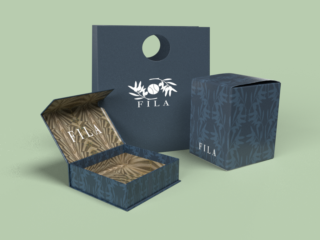
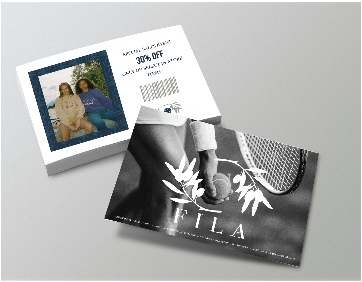
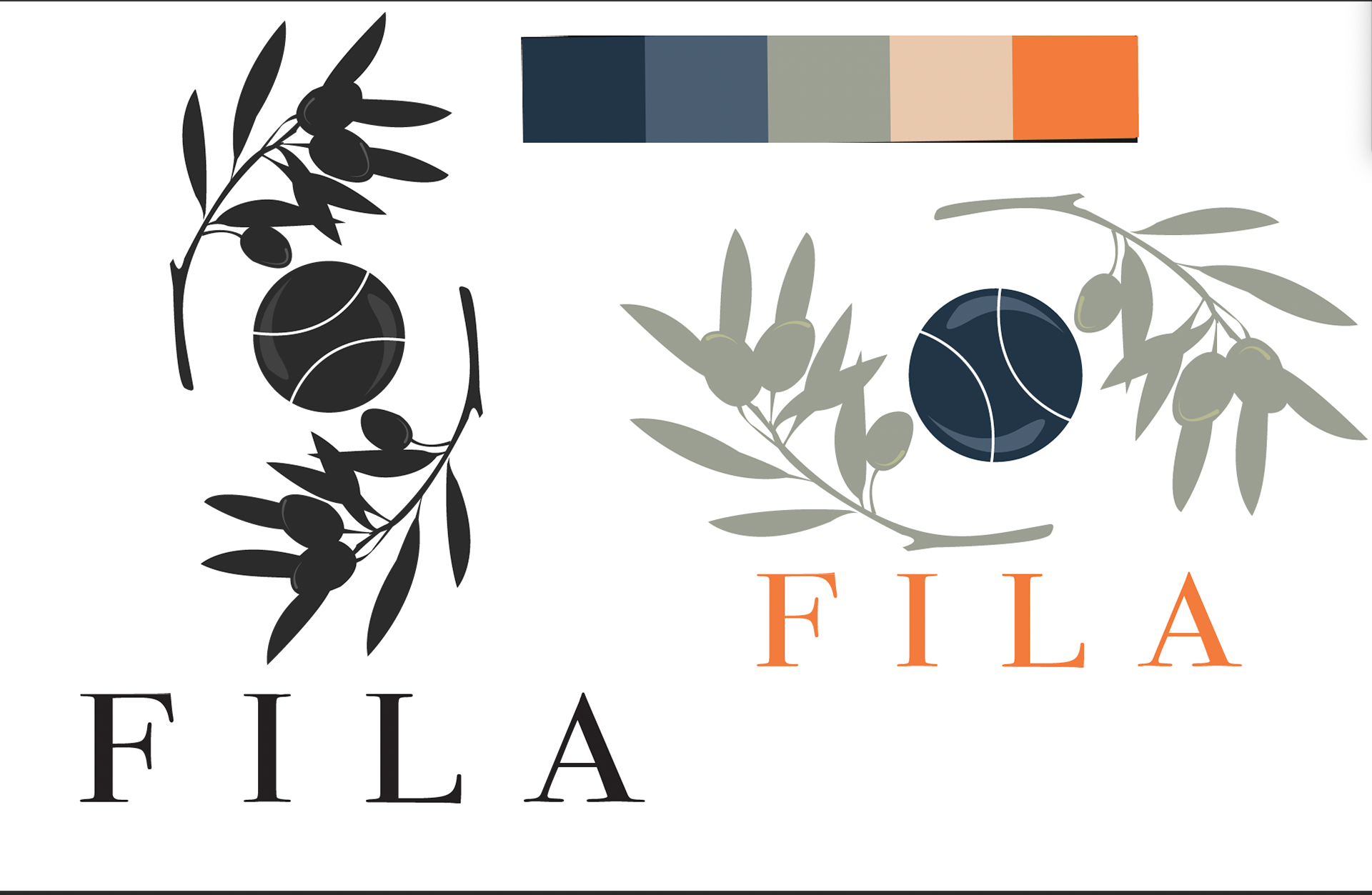
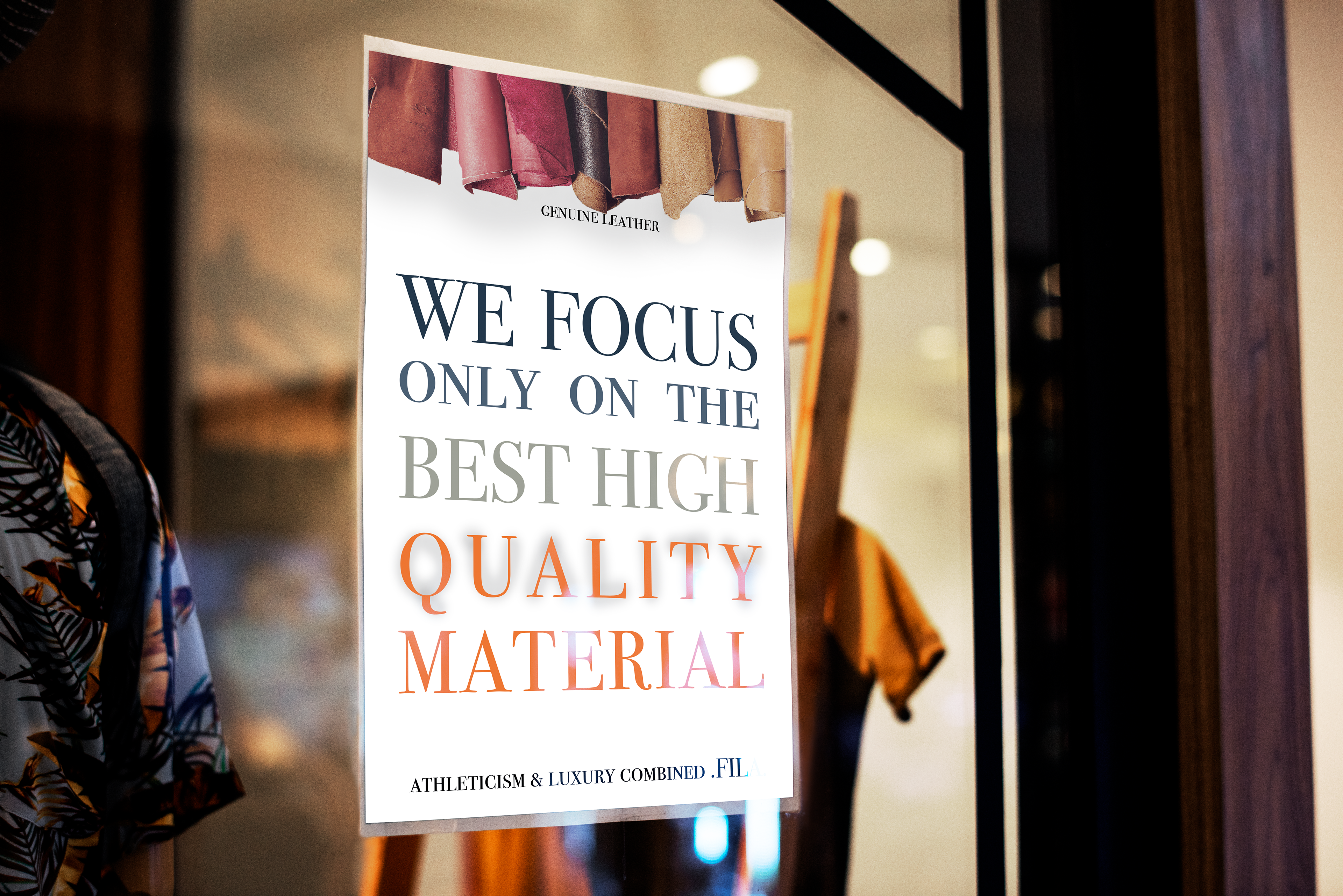
For this rebrand I wanted to go back to the original intention for the brand which was to be a high-end Italian brand. by using muted colors and naturalist materials natural iconography. The ads reflect the genuine handcrafted material used to create products. The logo is a combination of a tennis ball and two olive branches which relates how the brand gained early popularity and its Italian roots. The packaging uses the olive branches as a low contrast pattern and take imaging from Italian paintings to further push the Italian background.