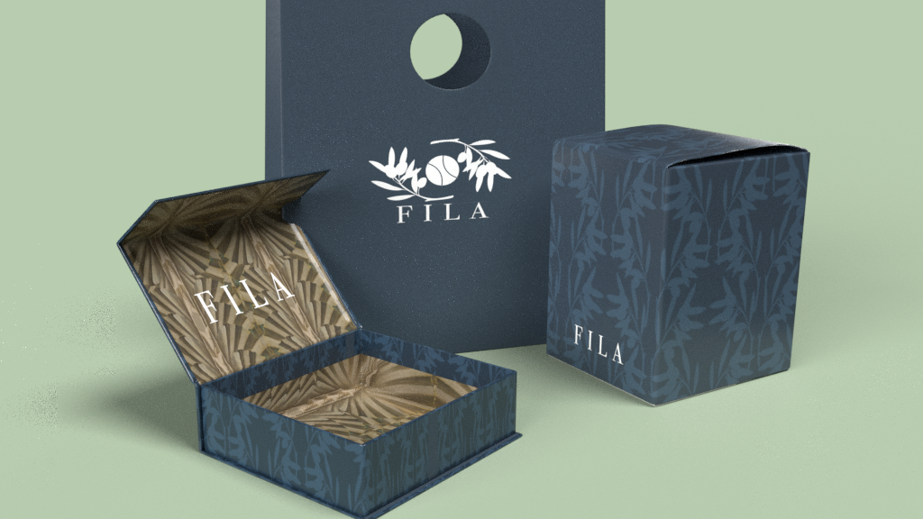
For this rebrand I wanted to go back to the original intention for the brand which was to be a high-end Italian brand. by using muted colors and naturalist materials natural iconography. The ads reflect the genuine handcrafted material used to create products. The logo is a combination of a tennis ball and two olive branches which relates how the brand gained early popularity and its Italian roots. The packaging uses the olive branches as a low contrast pattern and take imaging from Italian paintings to further push the Italian background.


